PROJECT OVERVIEW
CONTEXT & PROBLEM
EatWell App aims to help busy people eat healthy and balanced meals. Many users struggle to plan nutritious meals due to lack of time and end up choosing less healthy options.
The app allows users to build balanced plates based on the Harvard Plate Method using the ingredients they already have at home – helping to reduce food waste in the process.
· DURATION: 3 MONTHS | ROLE: UX DESIGNER
· METHODOLOGY: DESIGN THINKING
· TOOLS: FIGMA, MIRO, EXCEL
OBJECTIVE, APPROACH & RESULTS
The goal is to inspire users and make it easier for them to create healthy meals while helping reduce food waste and improve eating habits.
I followed a Design Thinking approach, starting with user research to understand their needs, defining the problem to solve, brainstorming creative solutions, prototyping the app, and finally, conducting iterative usability testing to refine the solution.
The result was a high-fidelity interactive prototype designed in Figma, ready for user testing before final development.
(1) EMPATHIZE · UNDERSTANDING USER NEEDS
In this first EMPATHIZE phase, we researched the needs and frustrations of users with limited time or experience in healthy eating to identify their pain points. By gathering real data, we established a starting point to define the problem we aim to solve.
RESEARCH METHODS

SURVEYS
To the users' eating habits to understand their behaviours

INTERVIEWS
To people trying to eat healthy but having very limited time

ANALYSIS
The Harvard Plate Method to ensure proper nutritional balance
💡 INSIGHTS & KEY FINDINGS
· LACK OF KNOWLEDGE ABOUT WHAT MAKES A BALANCE MEAL
· QUICK AND VISUAL OPTIONS
· NEED FOR INSPIRATION
USER STORIES & PERSONAS
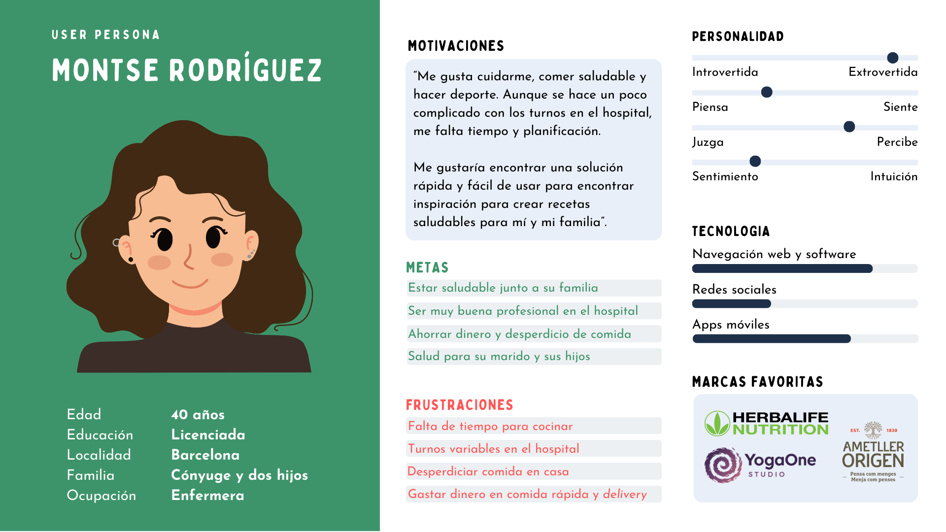
MONTSE’S USER STORY
“As a shift-working nurse with little free time, I want to prepare healthy meals quickly and with minimal planning so I can save time and reduce food waste.”
MONTSE’S PAIN POINTS
· Lack of time to cook
· Difficulty planning meals because of unpredictable shifts
· Limited practical options – struggles to find quick, realistic and nutritious recipes to fit her lifestyle
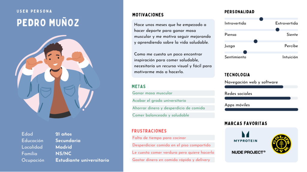
PEDRO’S USER STORY
“As a university student new to the gym and healthy eating, I want to find inspiration for preparing nutritious meals that motivate me to eat balanced so I can perform better in sports.”
PEDRO’S PAIN POINTS
· Lack of knowledge about healthy eating and how to create balanced meals.
· Struggles to find appealing and easy recipes that fit his fitness goals.
· Limited budget as a student.
(2) DEFINE · NARROWING THE PROBLEM
In the next phase of DEFINE, key insights are synthesized to formulate a Problem Statement, which is the definition of the problem, and then the POV Statement, the approach to the solution we aim to bring with the project.
PROBLEM STATEMENT
After understanding, analyzing, and empathizing with the users’ stories and pain points, the problem definition is:
💭 Users with little time and knowledge in nutrition need a simple way to access healthy and practical recipes with ingredients they already have at home, as they face difficulties in meal planning, finding appealing options, and avoiding food waste.
POV STATEMENT
How can EatWell solve this problem?
⭐️ EatWell will help people with irregular schedules and little cooking experience find healthy, quick, and accessible recipes tailored to their needs and preferences, optimizing their time and reducing food waste.
(3) IDEATE · GENERATING CREATIVE SOLUTIONS
In the IDEATE phase, brainstorming exercises were conducted to generate multiple creative solutions, with the main idea being selected: an app that suggests healthy recipes based on available ingredients. Additionally, it was decided to focus on the idea of creating the dish using the ‘Harvard Plate’ model, selecting foods by categories.
BRAINSTORMING & CRAZY EIGHTS
BRAINSTORMING
First, a brainstorming session was held to gather possible features for the app, such as informing the user’s goal and type of diet they follow, selecting foods based on categories, meal diary, and so on.
CRAZY EIGHTS
Once the brainstorming was done, Crazy Eights was used to sketch the first ideas for screens and features. After a review, (*) the features to be included in the first low-fidelity prototype (wireframe) for user testing were marked, and (?) other features were left on hold to be included in future iterations.
(4) PROTOTYPING · CREATING THE APP VERSIONS
In the PROTOTYPE phase, an initial version of the solution was developed in wireframe format to test the functionality and key features of the app with users. After the first round of user testing, the solution was iterated, and the ‘final’ high-fidelity prototype was developed up to that point.
LOW-FIDELITY WIREFRAMES
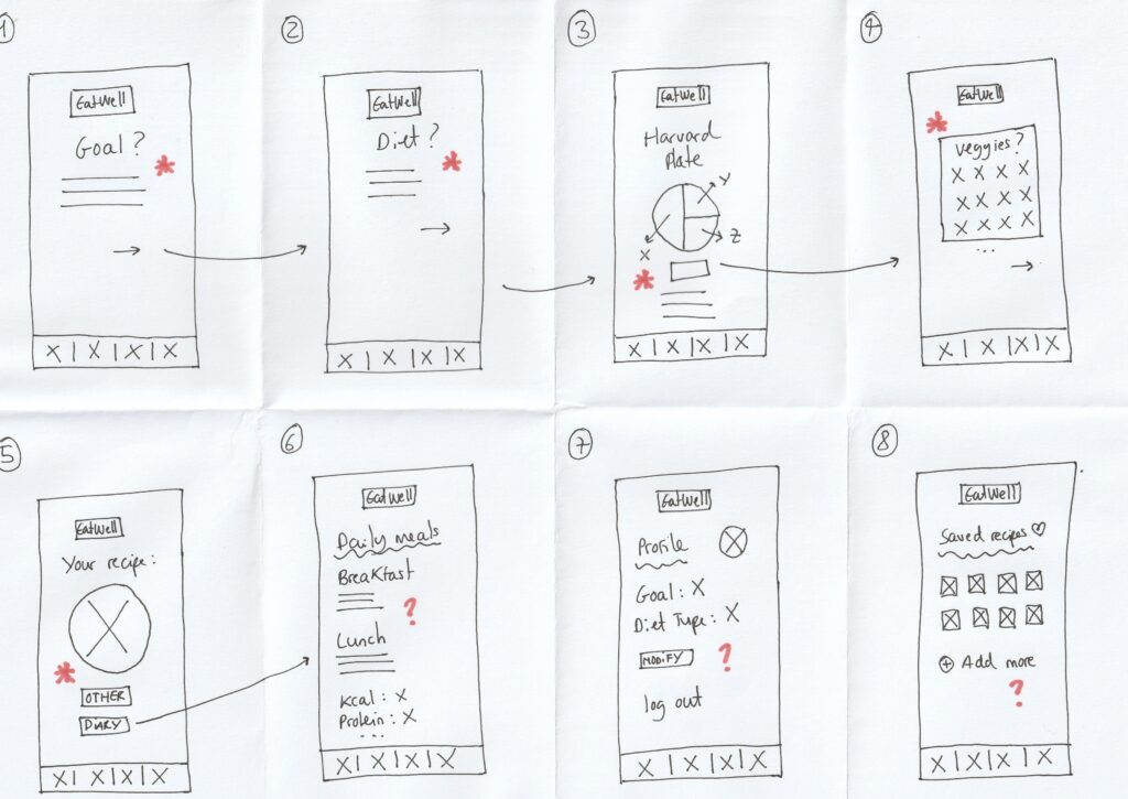
1ST. VERSION (WIREFRAMES)
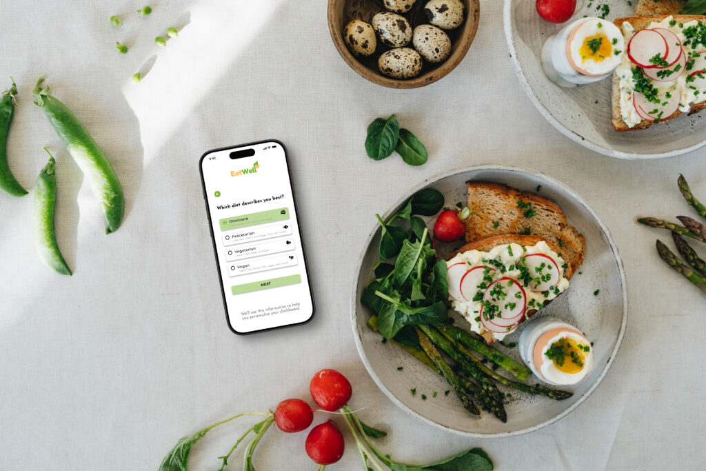
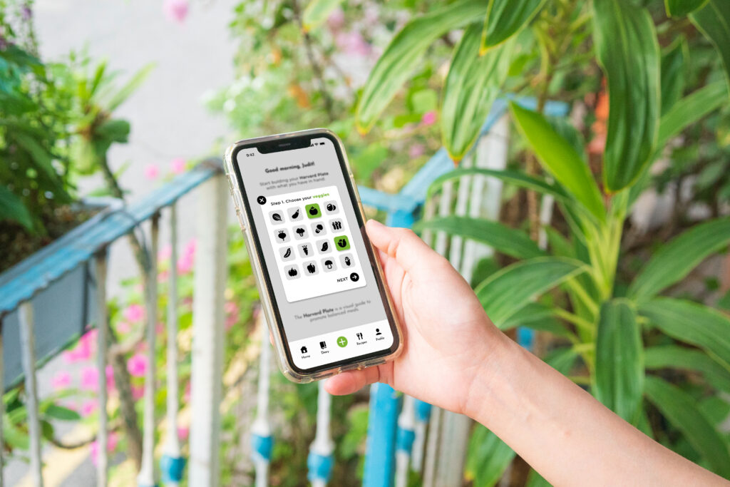
The first low-fidelity prototype of EatWell defines the navigation flow from the app’s home screen (login) to the creation of a balanced meal, including key steps such as selecting goals, the type of diet, and choosing the foods that make up the dish.
It allowed us to test with users whether the flow works and if the model of selecting foods to create a dish with the ingredients you have in the fridge makes sense. Additionally, it is a good starting point to continue improving the experience.
👇🏼 IMPROVEMENTS FOR THE NEXT ITERATION
· CLARITY IN THE INTERFACE AND VISUAL INDICATORS (COLORS, ICONS)
· IMPROVE INTERACTION AND FEEDBACK
· IMPROVE FLUIDITY (REDUCE FRICTIONS)
HIGH-FIDELITY PROTOTYPE
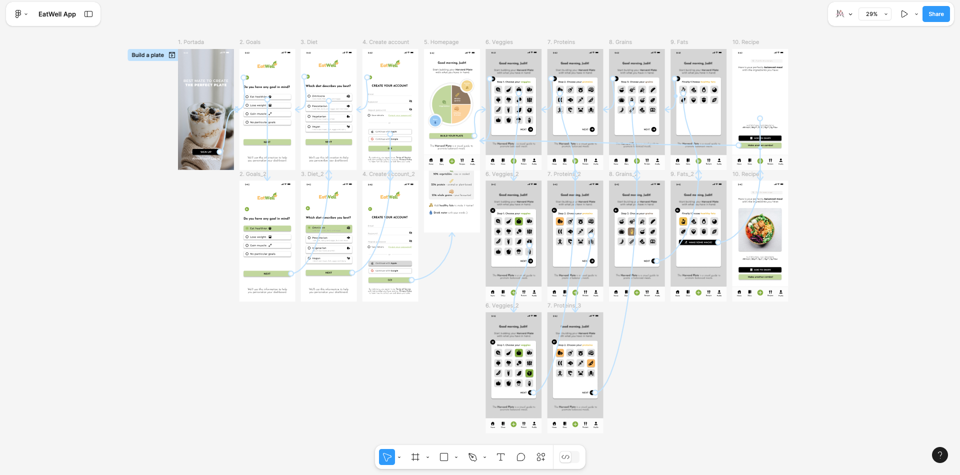
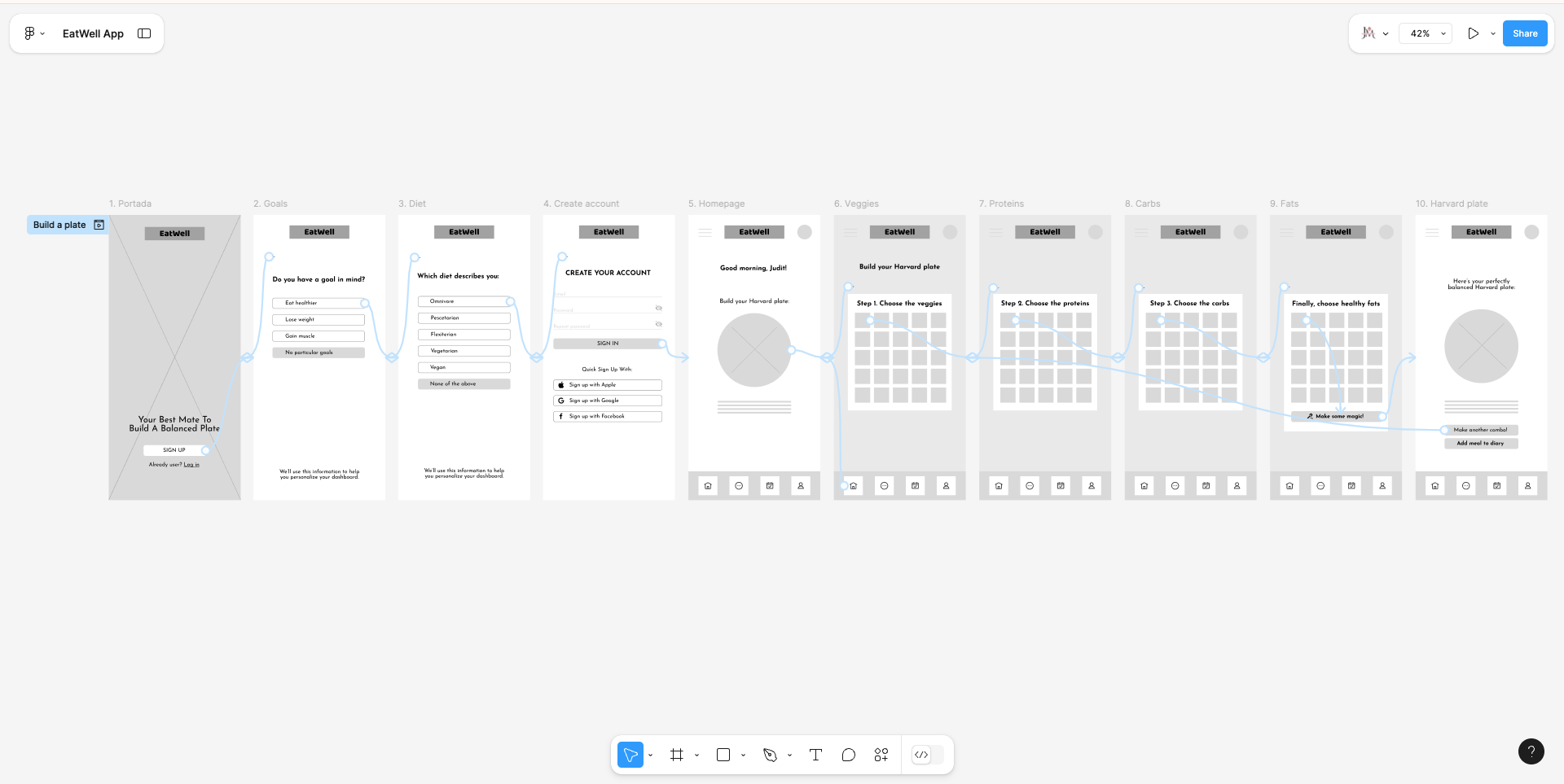
2ND. VERSION (HI-FI PROTOTYPE)
This high-fidelity prototype represents a significant evolution from the low-fidelity wireframes. Colors, typography, iconography, and visual elements have been incorporated to make the experience more intuitive and engaging for the user.
The last point of this case study is to test the high-fidelity prototype with users to identify areas for improvement for future iterations before moving on to the final development phase of the application.
(5) TESTING · EVALUATING AND IMPROVING THE SOLUTION
The usability test is a key phase in the user-centered design process, allowing us to validate the experience and identify areas for improvement before final development. In this case, an evaluation of the high-fidelity EatWell prototype was conducted with the objectives of determining the navigation flow, interaction and visual feedback, completion time, and, finally, the overall user satisfaction with their experience (UX) with the app.
👤 USER SELECTION
· 5 PARTICIPANTS WITH DIFFERENT CHARACTERISTICS
· USERS ALIGNED WITH OUR TARGET
· DIFFERENT ISSUES TO SOLVE
🎯 KEY TASKS TO EVALUATE
· REGISTER AND SET UP A PROFILE
· SELECT INGREDIENTS TO BUILD A HARVARD PLATE
· ADD CREATED DISH TO MEAL DIARY
🔎 TOOLS USED
· SCREEN RECORDINGS AND SESSIONS WITH GOOGLE MEET
· GOOGLE FORMS FOR SURVEYS AND COLLECTING POST-SESSION FEEDBACK
· HOTJAR TO TRACK HEATMAPS AND NAVIGATION PATTERNS
✅ POSITIVE ASPECTS OF THE APP
· INTUITIVE INTERFACE, CLEAR NAVIGATION
· ATTRACTIVE DESIGN: COLORS, ICONS
· SIMPLE INGREDIENT SELECTION PROCESS
❗️ PAIN POINTS AND IMPROVEMENTS
· MORE DETAIL IN THE REGISTRATION, NOT SUFFICIENT
· LACK OF LANGUAGE SELECTOR (ACCESSIBILITY)
· ABSENCE OF FILTERS FOR INGREDIENTS
💡 IMPROVEMENTS FOR FUTURE ITERATIONS
· DEVELOP QUICK REGISTRATION SCREENS
· VISIBLE LANGUAGE SELECTOR
· ADVANCED FILTERS FOR FOOD SELECTION AND FOOD NAMES
· OPTIMIZE APP LOADING TIME