The project focused on supporting Javi, a private luxury chef, in redefining his digital and visual identity, as well as rebuilding his website. To achieve this, we carried out a complete redesign of his corporate identity (logo, color palette, and typography) with the aim of conveying coherence, exclusivity, and approachability.
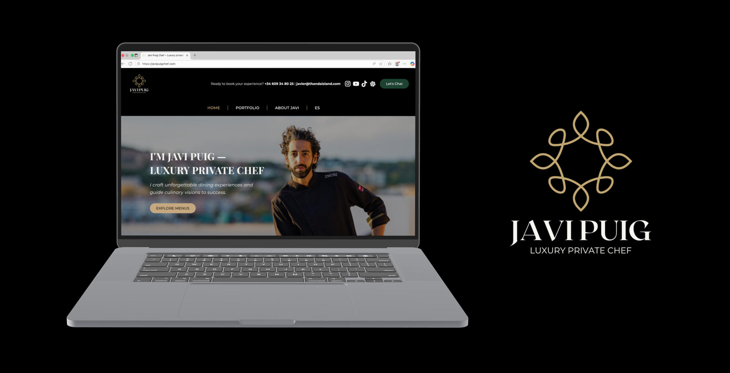
In addition, I developed a brand-new website from the ground up, designed to reflect his value proposition, clearly showcase his services, build trust with potential clients, and enhance the overall UX/UI experience. The result is a digital presence that is elegant, modern, and functional—strengthening his personal brand and amplifying his visibility online.
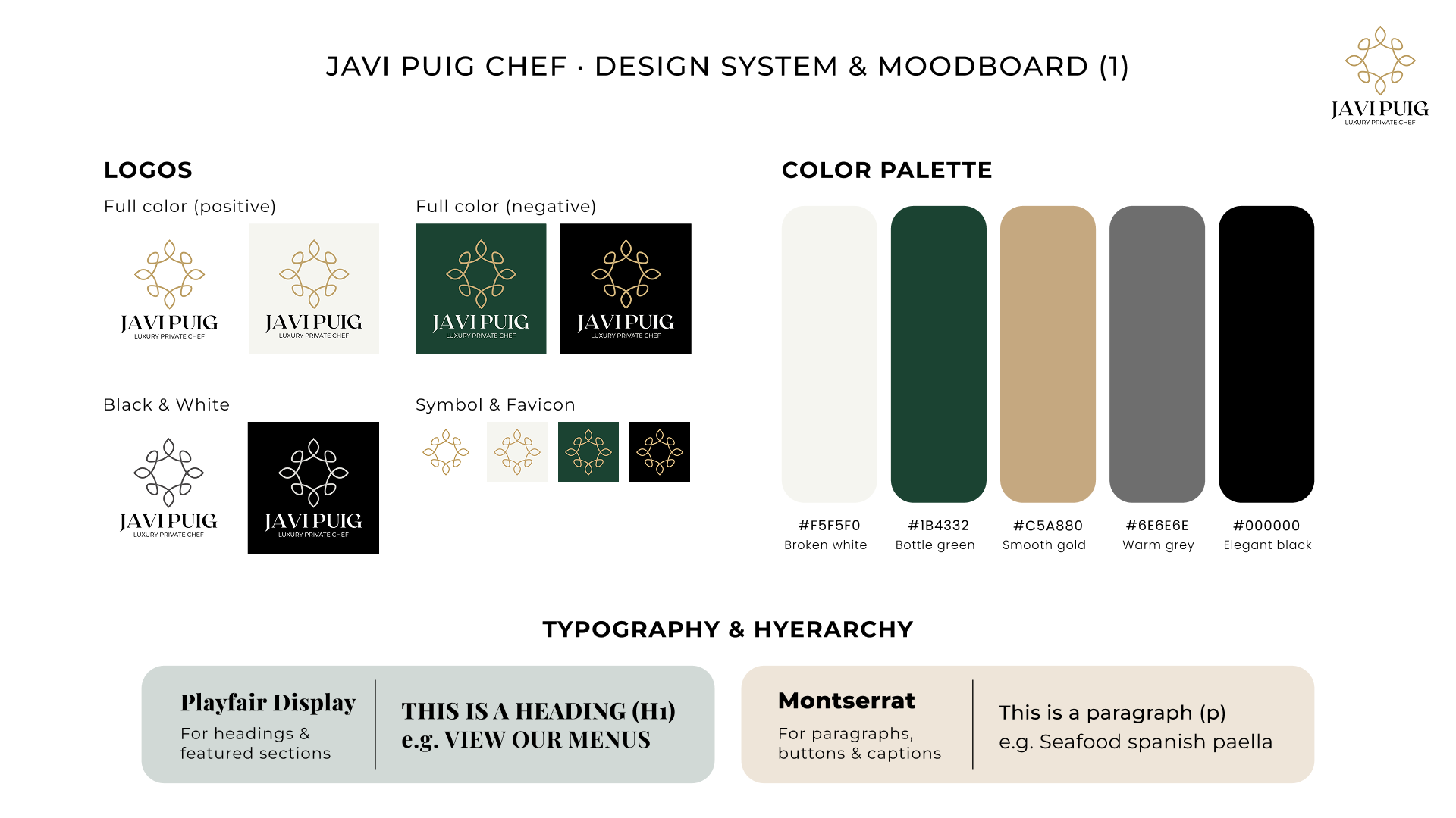
One of the pillars of the project was updating the brand’s visual identity. The existing logo was redesigned to convey a more modern and sophisticated character, in line with the exclusivity of the chef’s services.
Initial logo
a
Redefined logo
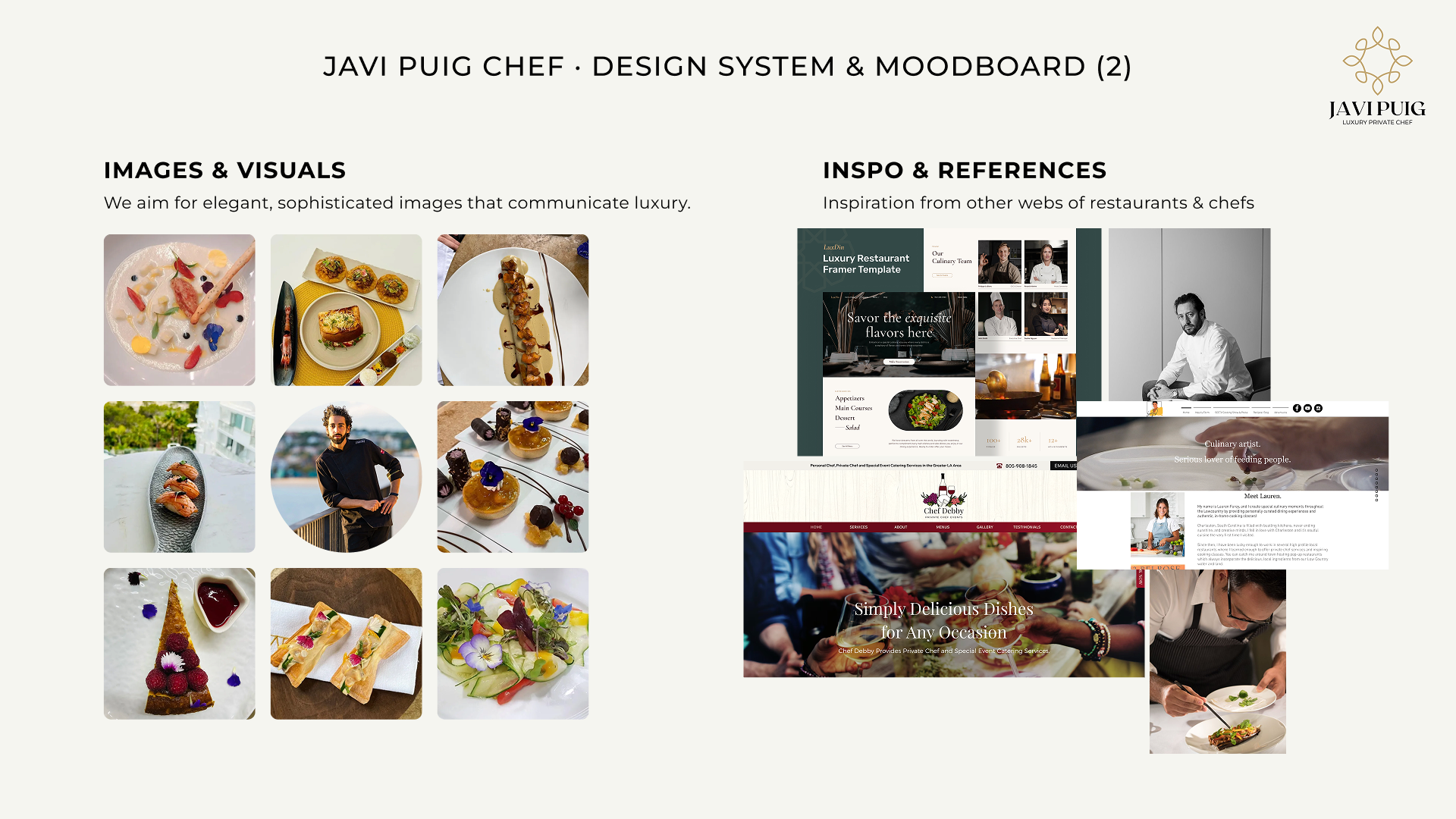
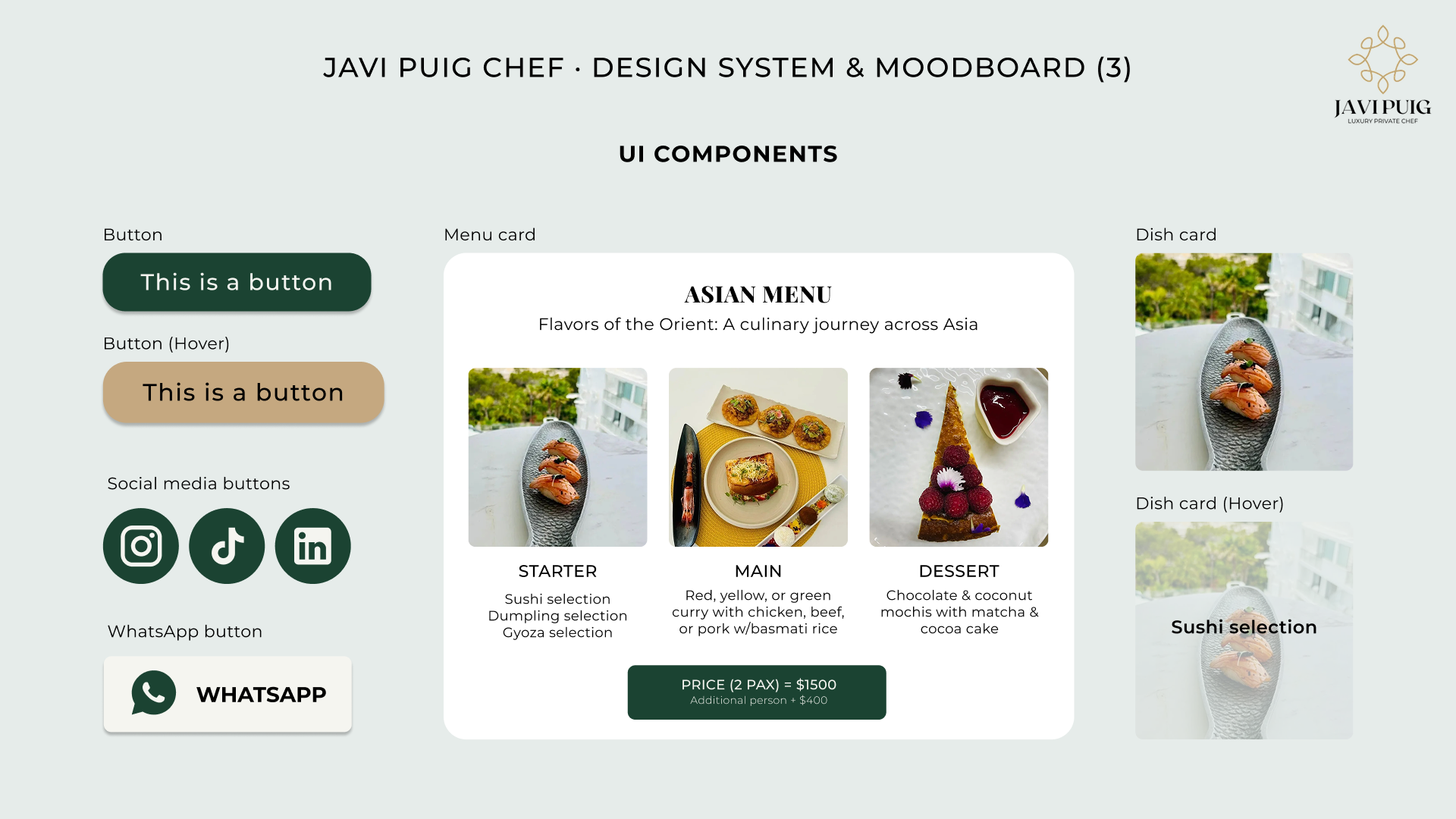
From there, I built a complete design system that includes logo variations, an elegant color palette, carefully selected typefaces, and a moodboard that defines the brand’s visual tone.
REBUILDING THE WEBSITE
HEADER & HERO SECTION
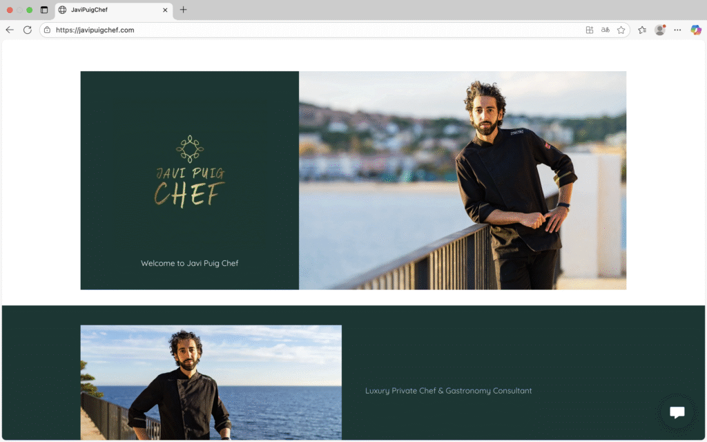
BEFORE
Hero lacked a header, featured a dark green background with a welcome message that was not visible.
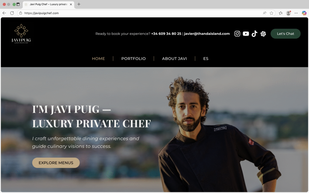
NOW
In the redefined version, the hero section includes a header, a structured menu, and a clear call to action.
VALUE PROPOSAL
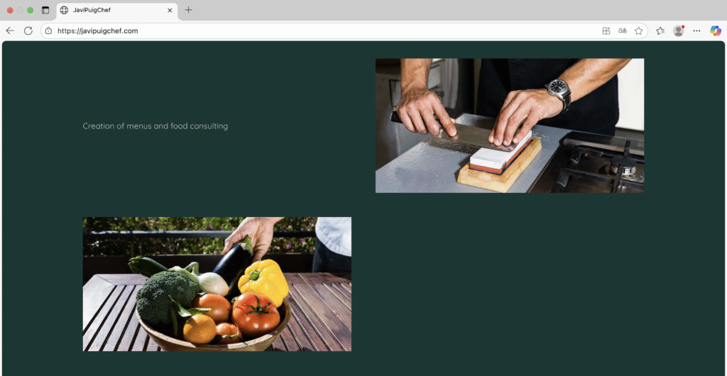
BEFORE
In the first version, the value proposal was very basic: images without hierarchy and a generic text.
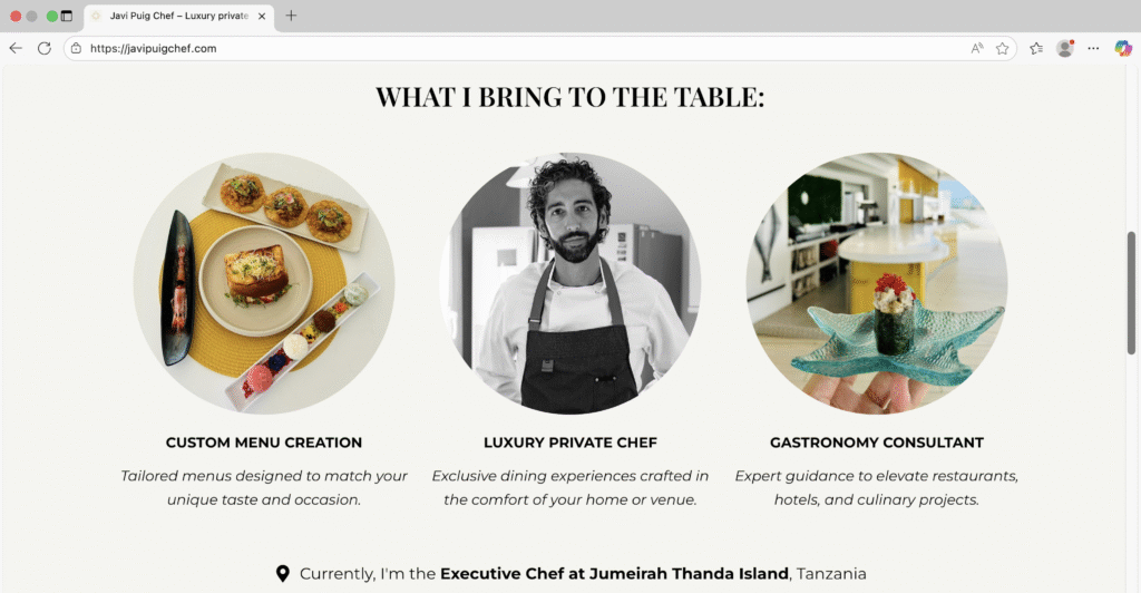
NOW
In the redefined version, the section is organized into three blocks, each with titles, descriptions, and images.
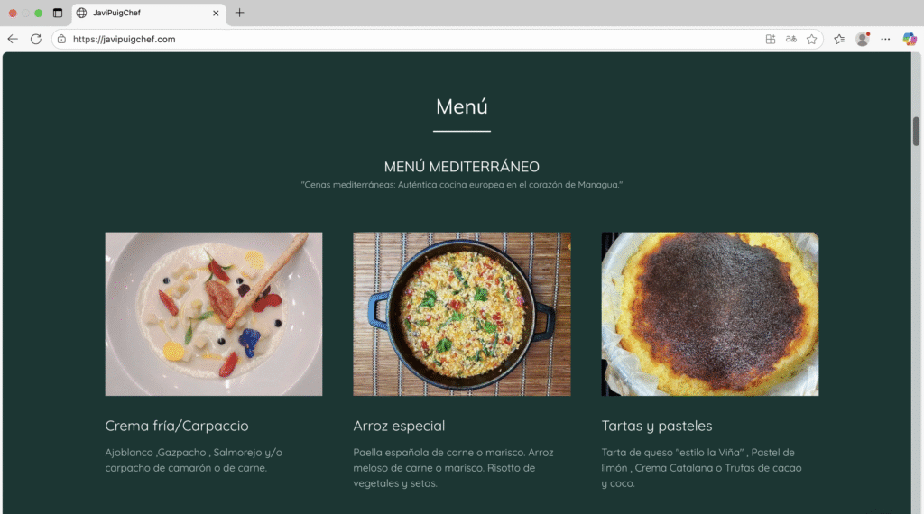
EXPERIENCES & MENUS
BEFORE
Previously, the section showcasing the chef’s menus was static, monotonous, and lacked interaction.
NOW
Now, the section features an expandable carousel with the three interactive menus.
MORE UX · UI IMPROVEMENTS
· In the original website, there was a dedicated PRICES section, which has now been integrated into the menus section.
· The PORTFOLIO used to be part of the homepage; in the new website, it has been developed as an independent page.
· The CONTACT section has been added to both the header and the footer in the new site.
· The TYPOGRAPHY in the original website was too small and lacked contrast. In the new version, the font size has been increased and contrast improved to ensure better accessibility.
· The REVIEWS, which were previously screenshots of Google Reviews, have now been properly formatted and integrated into the website.